Redesign Discussion: The Remote
Problems identified by the evaluations
When we previously looked at existing technology for the system, it was clear that personal alarms were not uncommon. However, there's some conflict. Designs like this:
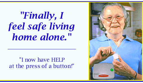
seem to fill the size and weight criteria for something that needs to hang around your neck, but given that a) Anna experimented with the problems arthritic users might face with a tiny remote and b) we have more than the alarm button on there, we couldn't purely rely on existing technology.
One of the best designs by far we drew inspiration from was the remote for the Nintendo Wii:

We considered it a good design for the following reasons:
The buttons were also deliberately simple, consisting of simply the alarm button, four directional keys and an 'enter'. The speaker is the last feature, and all were well spaced out within the given size. In a previous meeting, we decided they would be hard buttons rather than soft ones, as the soft buttons are easily worn away and can be difficult to press due to squidginess (totally a real word ;) ). Alarm button is kept separate entirely from
Possible ideas for redesign
The alarm button problem
I'm throwing up some suggestions now for the final design. PLEASE comment and discuss!
First of all, final size, with a figure and hand comparison:

Any bigger than this and I think the remote will just be too bulky. Measurements (35-40mm wide, 80mm long, and 7mm deep). Edges are rounded and the plastic soft for comfort.
Now, the tricky bits . . .

Please give me your feedback on this ASAP, guys!
- Alarm button - too complicated to activate at present, particularly if particular disabilities are taken into account.
- Speaker alerts - potentially require volume control
- Need to emphasise the size, shape etc. of the design and it must be light, non-bulky and robust.
- Need support in case the user loses the remote in the house.
When we previously looked at existing technology for the system, it was clear that personal alarms were not uncommon. However, there's some conflict. Designs like this:
seem to fill the size and weight criteria for something that needs to hang around your neck, but given that a) Anna experimented with the problems arthritic users might face with a tiny remote and b) we have more than the alarm button on there, we couldn't purely rely on existing technology.
One of the best designs by far we drew inspiration from was the remote for the Nintendo Wii:
We considered it a good design for the following reasons:
- The remote has been shown to be used by young and old alike.
- The slender design fits comfortably in the natural curve of your hand and is quite easy to use.
- Simplistic array of buttons, nicely spaced out, easy to reach and press.
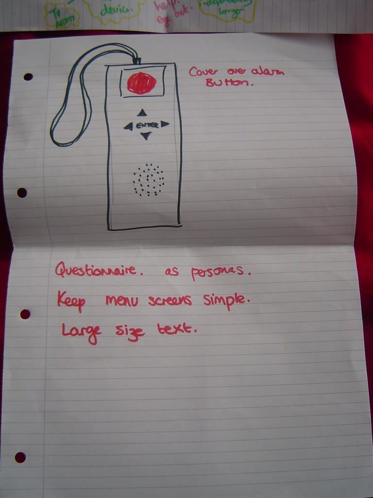
The buttons were also deliberately simple, consisting of simply the alarm button, four directional keys and an 'enter'. The speaker is the last feature, and all were well spaced out within the given size. In a previous meeting, we decided they would be hard buttons rather than soft ones, as the soft buttons are easily worn away and can be difficult to press due to squidginess (totally a real word ;) ). Alarm button is kept separate entirely from
Possible ideas for redesign
The alarm button problem
- Is prevention really better than cure?
- Could we use the speaker to ask the user to confirm that they've pressed the alarm button in order to properly activate it, or is this simply too much given the circumstances it ought to be pressed in?
- Any other possible recovery options that could enable us to simplify the button activation? This would increase the potential for accidental pressing, but if an alarm can be easily cancelled, would accidents matter?
- Otherwise, the 'press and twist' function has to go.
- Suggested ideas include a sliding button, a button cover, or a time-sensitive pressing function requiring the alarm button to be held down. Current problems carry over to these ideas to some degree.
- I was reading another group's blog and came across mention of Fitt's law. One of the essential notions here include that things done more often should be assigned a larger button. Alarm button is for emergencies ONLY, so if we're going to keep it the largest feature of the remote, it should be CLEARLY identified as an alarm. Thus far, the button being 'danger' red is a good start, and if "ALARM" is printed on the button itself, this should prevent it being pressed instead of the enter key, for example.
- Another problem - red buttons on remotes are often used as power buttons. Could cause big problems if the user mistakes this!
- We need a button that will allow easy access to the TV interface. Can enter double-function as 'on', or is this too confusing and non-intuitive?
- Once the alarm button is activated, I think the speaker should deliver a confirmation message to reassure the user.
I'm throwing up some suggestions now for the final design. PLEASE comment and discuss!
First of all, final size, with a figure and hand comparison:

Any bigger than this and I think the remote will just be too bulky. Measurements (35-40mm wide, 80mm long, and 7mm deep). Edges are rounded and the plastic soft for comfort.
Now, the tricky bits . . .
- Navigational keys are perfect, but I'm not sure of their positioning. The remote is quite small, so when it's sitting in your hand, your thumb is not necessarily resting in the centre of the remote as we originally posited. It's actually at the top. However, if the user is pointing the remote, they may not have it snug in their hand, in which case their thumb position will be different. Hence I'm gonna stick with the positioning in the centre of the remote for now as the best compromise.
- In terms of functionality, I think using any of the navigational buttons cognitively will signal that the user wishes to use the system interface. As a result, I think although the enter key should be encouraged as the one that 'takes action', pressing any of those keys should make the interface come up. A different 'power' button will just clutter up the layout and is unnecessary.
- Alarm button - obviously the most significant, but hopefully not most used button on the remote. for this reason, I've tried to distinguish it as much as possible as being 'exceptional':
- button is RED, as opposed to light grey like the navigational buttons
- button is INSET, as opposed to raised like the navigational buttons
- button is LABELLED
- The functionality of the alarm button is perhaps the biggest change. My current suggestion is to
 keep it a basic button, with the above identifiers to make it clear it is an emergency button only. The following will then occur when the alarm button is pressed:
 - The speaker on the remote will issue something like this message "You have just pressed the alarm button. Help will be on the way as soon as possible. If it was pressed by accident, please press it once again in order to cancel your alarm".
- Now, I'm aware that, in a panic after an accident, a user may try to press the alarm button several times. My suggestion to avoid inadvertent cancellation is as follows:
- Following the initial button press, button presses will not be recognised until the message has been played in full.
- After the message has been played, there will then be a period of perhaps 20 seconds where the user can, having heard the message, press the button again. After this time period is up, emergency contacts are contacted and pressing it again will not cancel, as the user is likely to press the alarm again if they're waiting a long time for help to arrive. If pressed again after the cancellation period, the speaker will issue a message such as: "Your emergency contacts have been called; help will arrive as soon as possible."
- This is the best possible compromise I can think of that doesn't sacrifice simplicity of design just to prevent accidental button presses. If the button is pressed, the default reception should be that it has been pressed correctly. Even if it ends up not being an emergency, it's better that a false call got through than to run the risk of the user being unable to work the remote when they need it most.

Please give me your feedback on this ASAP, guys!
posted by Samantha at 5:43:00 pm
![]()

2 Comments:
This is all really good Sam!
My only comment is that when I was experimenting with sello-taped fingers and remote controls, I actually ended up holding the remote with one hand and poking at the buttons with the other. I think this is more likely to be the way that an arthritic user would attempt to use it, so we might not need to worry too much about the thumb positioning. (Much like the user in your first picture.)
I like your design pictures, they make it nice and clear as to how the remote will look and feel. An inset alarm is definitely the best way to go and I agree with your suggestions for how it ought to work. Good work!
Great stuff!!
There really isn't any point I can argue against.
I also agree about having an inset alarm button.
Post a Comment
<< Home